Data & Insights
My love for data runs deep—so much so that it earned its own category! From understanding donor behavior to improving internal processes and outreach strategies, I use analytics and systems to help organizations make informed decisions. My goal is to turn information into insight, and ultimately telling the story (as usual) behind the numbers.
How I organize and maintain accurate, accessible, and meaningful data across platforms:
Donor database management (Blackbaud, Raiser’s Edge, eTapestry)
Data cleansing, segmentation, and reporting
System integrations between CRM, marketing, and event platforms
Information architecture for project tracking and analysis
How I use raw data to identify trends, tell stories, and make decisions:
Web analytics (Google Analytics, Meta Insights)
Fundraising and campaign performance reporting
Survey and program data visualization (Tableau, Power BI)
How I use systems and tools to help teams work smarter:
Project management (Wrike, Asana)
Process mapping and workflow automation
KPI tracking and performance dashboards
Software & Systems
Blackbaud Technology
Raiser’s Edge + NXT
eTapestry
Blackbaud CRM
Luminate
Fundraising
Classy
GoFundMe
Greater Giving
Mobile Cause
Auctria
Social Media
Hootsuite
Sprout Social
Meta Business Suite
Website
Wordpress
Squarespace
Wix
Project Example
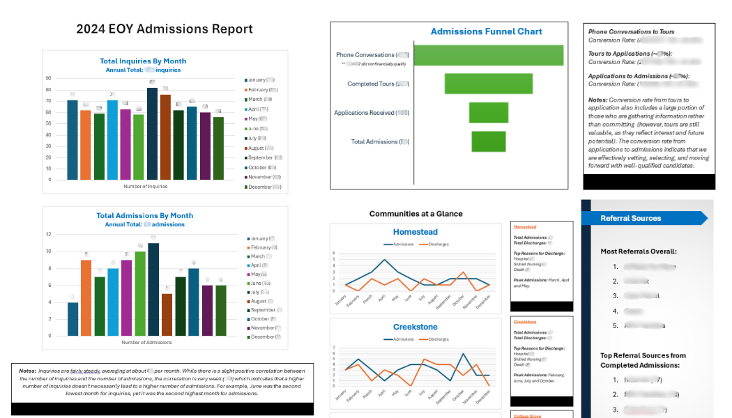
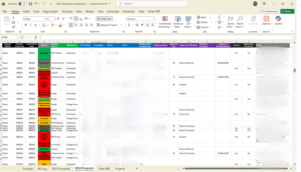
This is a visual look at how my brain operates! When I first came onboard, there was no centralized system to track admissions. There were only paper records and inconsistent individual methods between all three communities, so I developed a comprehensive admissions tracking matrix in Excel to streamline data management and improve visibility across the entire admissions process.
The spreadsheet tracks everything from new inquiries and prospect statuses, to admissions, discharges, and revenue trends—while also serving as a project management tool. It follows each prospective resident through every stage of the process, identifying where individuals fall off and helping to pinpoint opportunities for improvement and stronger conversion rates. I’ve also included my 2024 EOY Report for reference of this data visualization.